Xamarin.Forms are awesome and its always providing you with a native build where shared application logic layer and UI bundles together. Built-in Xamarin.Forms view controllers are also giving a huge advantage to add functionalities to the app from the user experience and user interface perspective.
However, its impossible to mix and match developers creative needs by the Xamarin engineers who build API’s for the forms UI. For that, we have one-stop solution that is the Xamarin.Forms Behaviors.
https://blog.xamarin.com/extend-xamarin-forms-controls-functionality-with-behaviors
Lets see how we can create a simple behaviour. In this behaviour i’m going to demonstrate a validation routing picker controler. Note that these behaviours can be applied to any of the views in Xamarin.Forms.
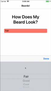
Here, the picker background color will change when the item is not represented in the current list of values.
Behaviors Methods
To start with, all behaviors must inherit from the Behavior<T> class.
|
3
4
5
6
7
8
9
10
11
12
|
public class SimplePickerValidator : Behavior<Picker>
{
protected override void OnAttachedTo(Picker bindable)
{
base.OnAttachedTo(bindable);
}
protected override void OnDetachingFrom(Picker bindable)
{
base.OnDetachingFrom(bindable);
}
|
There are two methods that we override here:
OnAttachedTo: Gets invoked whenever the behavior is attached to thePicker.OnDetachingFrom: Is naturally invoked when the behavior is being removed from thePicker.
Note that a strongly typed Picker is passed in to both methods. This is because we inherited from Behavior<Picker>.
When implementing a behavior, you’ll generally want to handle an event that the host control emits. Inside that event handler, you’ll be able to add the additional functionality, or additional behavior, to the control. So, the OnAttachedTo becomes the place to subscribe to the event, while the OnDetachingFrom becomes the place to unsubscribe from the same event.
This SimplePickerValidator behavior now looks like this:
Implementing
Before implementing the Bindable_SelectedIndexChanged method, there needs to be a way for the calling code, like the XAML page, to specify what the correct values are for this behavior to validate against.
Bindable properties to the rescue! That’s right, behaviors can contain bindable properties, just like any other Xamarin.Forms control. Add a property called ValidValues like so:
|
2
3
4
5
6
7
8
9
10
11
12
13
14
15
16
17
18
19
20
21
22
23
24
25
26
27
28
29
|
void Bindable_SelectedIndexChanged(object sender, EventArgs e)
{
// Bound and cast to a picker
if (!(sender is Picker bindable))
return;
// Make sure the picker is data bound
if (!(bindable.ItemDisplayBinding is Binding displayBinding))
return;
// Get the binding’s path
var displayBindingPath = displayBinding.Path;
// Use reflection to get the value of the selected item of the picker
var selectedItem = bindable.SelectedItem.GetType().GetRuntimeProperty(displayBindingPath);
var selectedText = selectedItem.GetValue(bindable.SelectedItem);
// Check to see if everything is valid
if (ValidValues != null && ValidValues.Contains(selectedText))
{
IsValid = true;
bindable.BackgroundColor = Color.Default;
}
else
{
IsValid = false;
bindable.BackgroundColor = Color.Salmon;
}
}
|
Here’s what’s going on in the above event handler: because the behavior is checking to see whether the displayed value in a data-bound Picker is equal to a value in an array, you first need to get that value out. You can use reflection to get to the text displayed in a Picker‘s data binding.2
Once the value is in selectedText, check to see if that exists in the ValidValues array.
Adding Behaviors
The very last step is to add this behavior to a control. In XAML, it would look like this:
|
2
3
4
5
6
7
8
9
10
11
|
<Picker Title=“Rate Your Beard”
ItemsSource=“{Binding BeardRatings}”
SelectedItem=“{Binding SelectedBeardRating}”
ItemDisplayBinding=“{Binding Description}”>
<Picker.Behaviors>
<local:PickerColorBehavior
ValidValues=“{x:Static local:BehaviorsPageViewModel.ValidRatings}” />
</Picker.Behaviors>
</Picker>
|
Note the property<Picker.Behaviors> is the collection where this (and any other Behaviors) are added, and that the local XAML namespace was defined elsewhere.
Reference and Sources: Xamarin Official Blog


